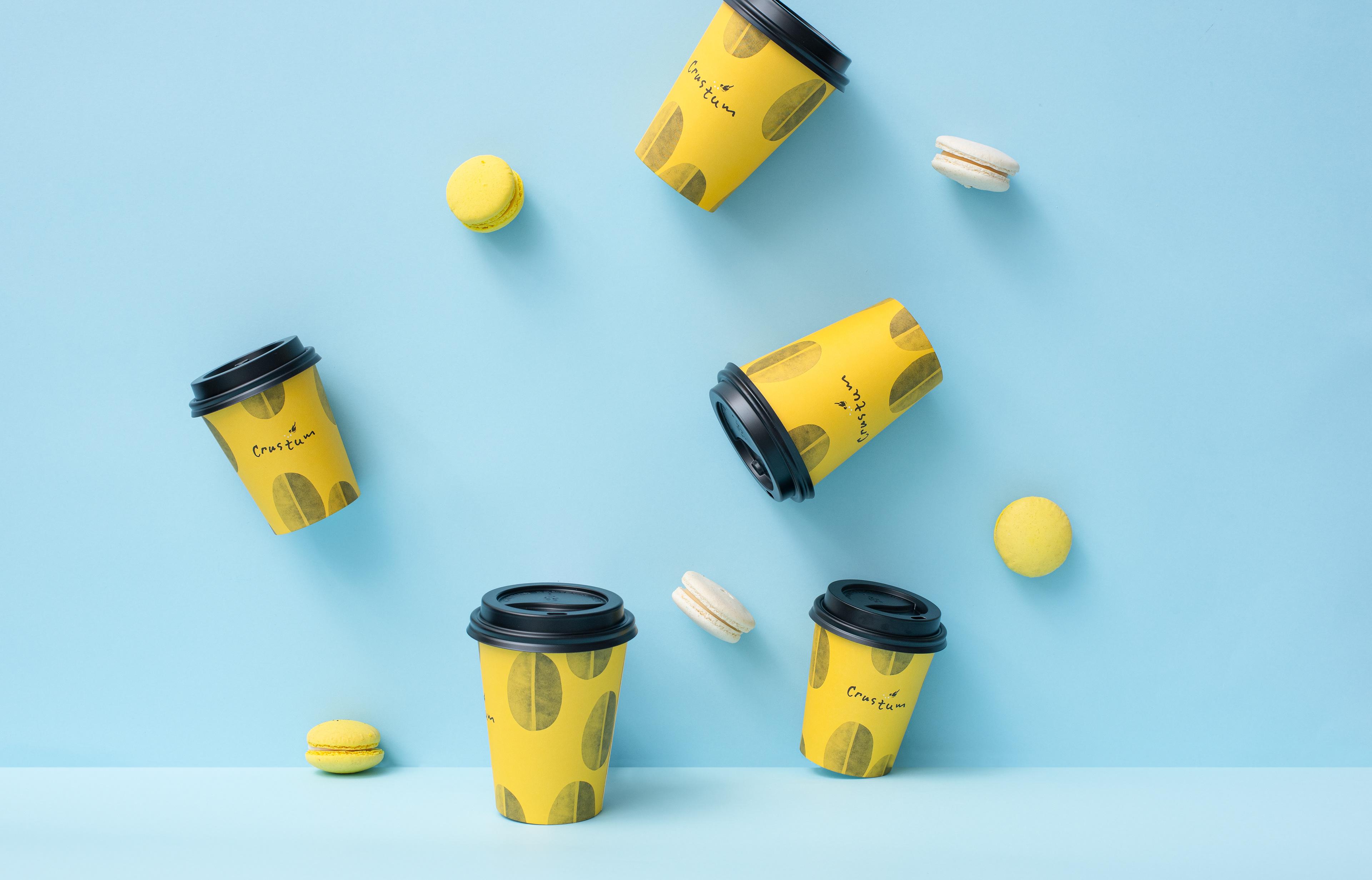
Coffee
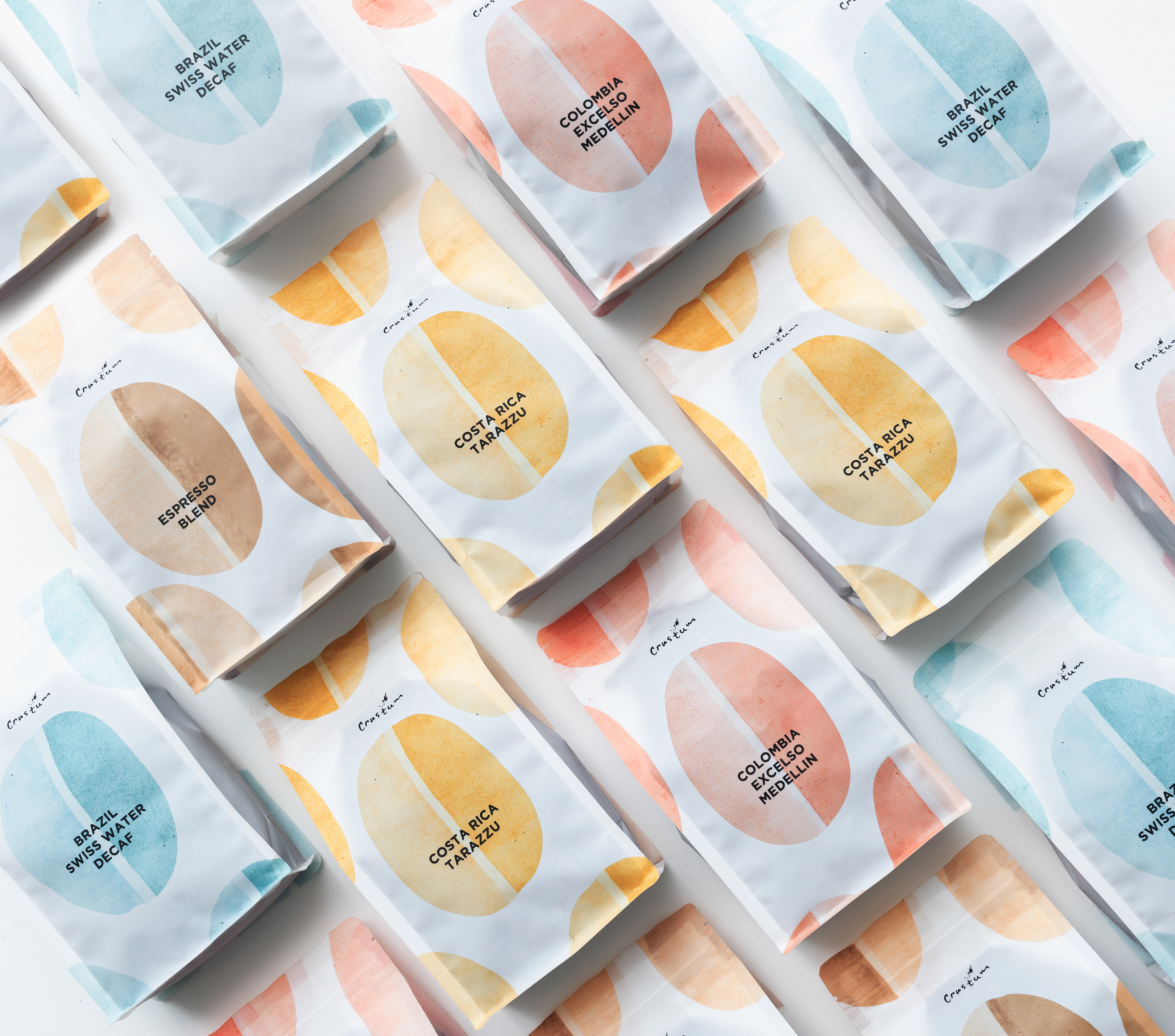
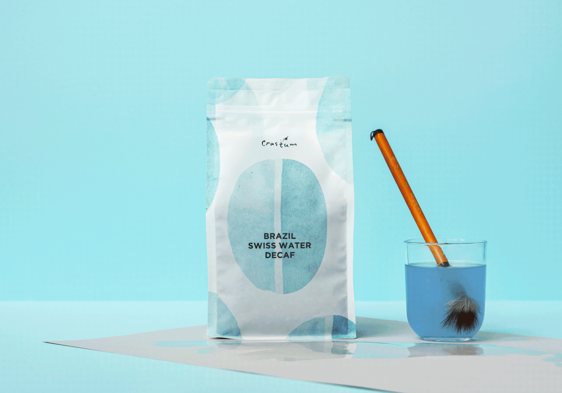
Enjoying coffee is more than just a matter of liquid meeting tongue. All five of your senses play a part, some in entirely surprising ways. So feel the taste of coffee with just in the sight. This packaging is all about clarity, especially in how it shows off the beauty and taste of the coffee bean. This design tries to introduce coffee in a completely new way by brushing the coffee beans with watercolours in different colours which are extracted from the best coffee bean countries so that the buyer can separate their favourite taste.
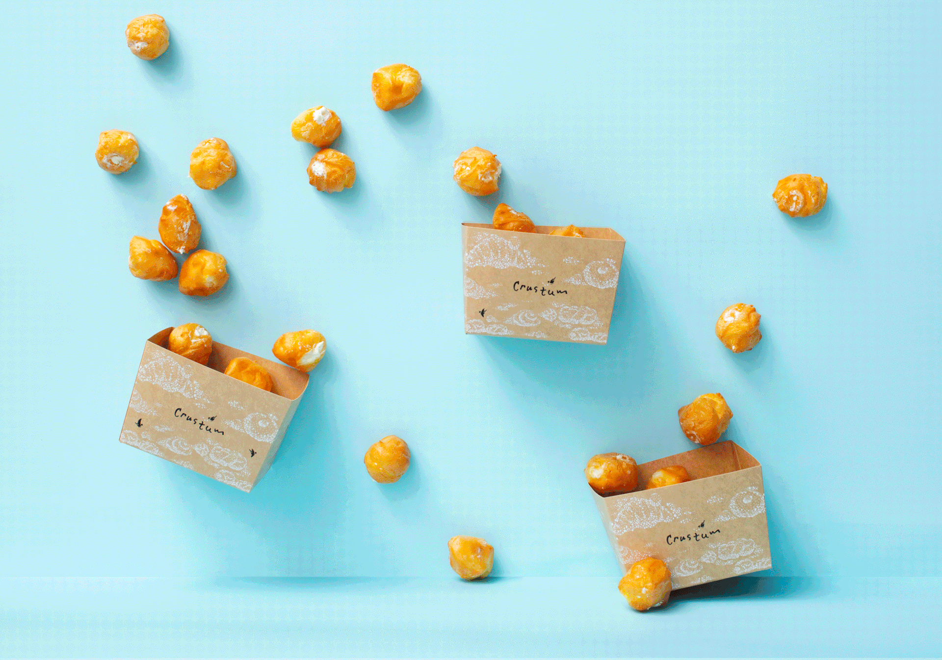
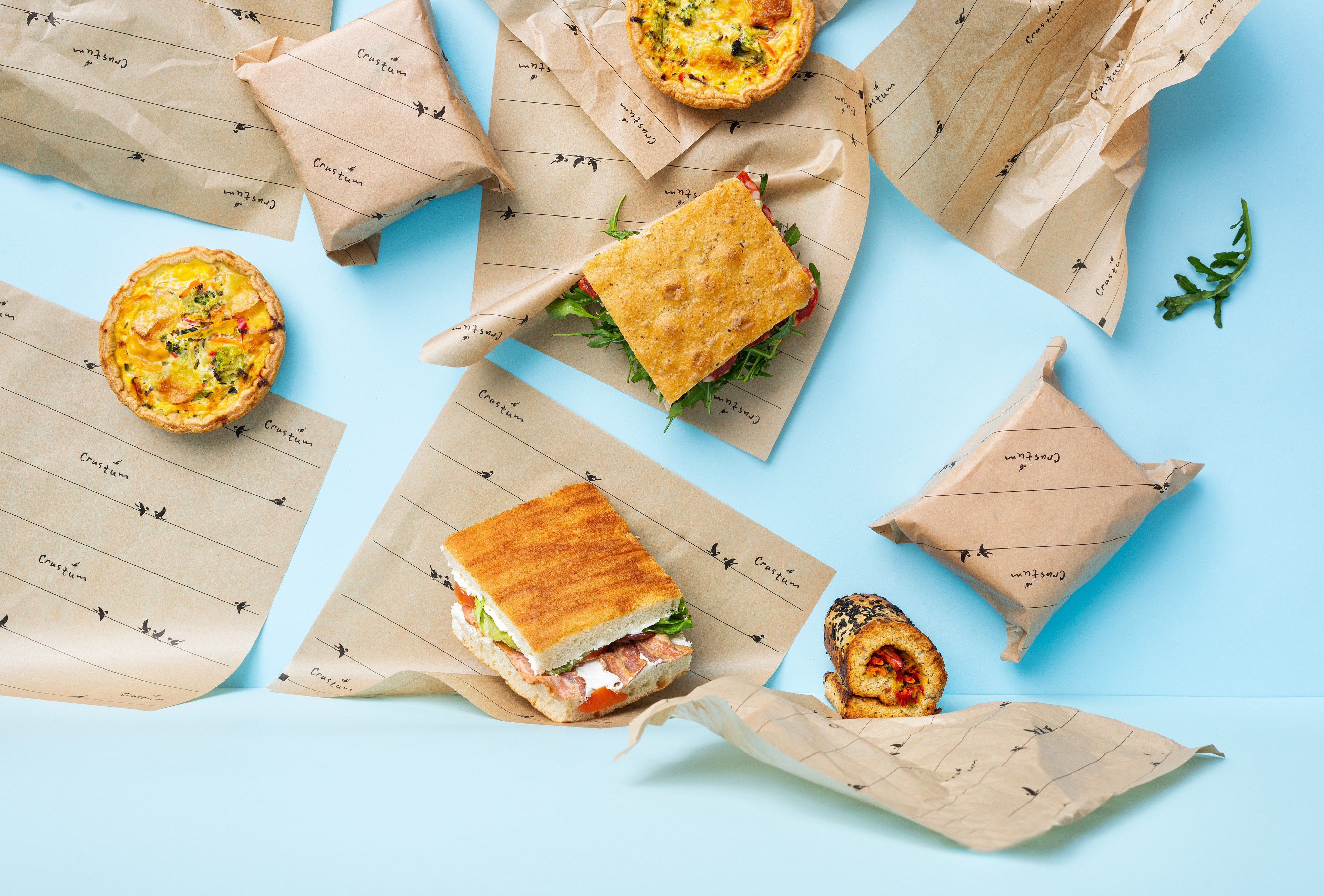
Clouds
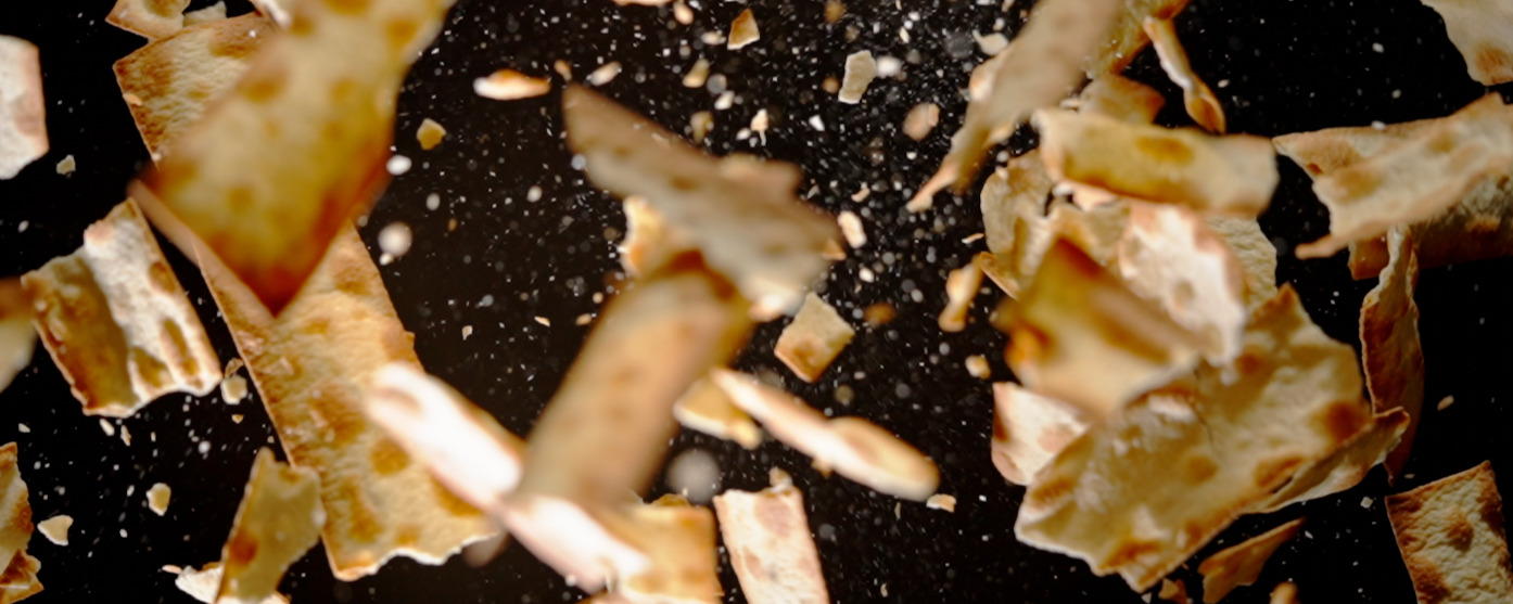
Clouds are often reflective of a variety of moods depending upon their appearance. Since time immemorial, clouds have inspired humans to mold their feelings into words or thoughts. So various cloud shapes inspired us to create a design that would reflect the Crustum bakery itself - the small white dots of flour depict a variety of baked pastries that are so light, beautiful, and look like clouds that you sometimes even want to eat.

Client: Crustum
Agency: Pencil & Lion
Creative director: Aurimas Kadzevičius
Project director: Diana Augūnaitė
Designer and illustrator: Birutė Bikelytė
Photographer: Kernius Pauliukonis / PACKSHOT
Year: 2021